2b.1
|
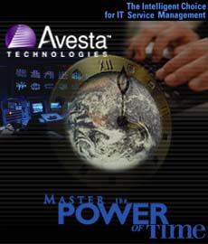
Changes include:
- Logo enlarged
- Globe inserted in clock face
- "Power" typeface changed to more corporate (Gill Sans)
(I have made minimal changes on this version.)
2b.2
|
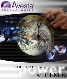
Changes include:
- Logo enlarged
- White background created to move towards a more corporate feel-lightened up a bit for more drama cerated through the contrast, and faded "power"
- Imagery encased by screen shape. I feel this loosens up the square rigidity
- Secondary tag line removed
- "Power" in white so as not to fight with "Avesta", but not too small so as to maintain the impact. Both power and Avesta don't "fight" here because htye are opposite colors. We can even insert the secondary tag line here as i the size at the right without crowding. The only change I might suggest is to darken the area directly behond "power", but only abit. The softness conveys a confidency - we don't have to boast with a clearly spelled out word "power".
- New more corp. tag line treatment
Notes: This new oval "screen" encasement may work well as a continuous look for other imagery, and packages. If we keep to the horizontal lines, screen shaped picture boxes and a "black / white / lavender" palette, I feel we will establish a solid identity.
2b.3
(CD and web page displayed to show primary identity extract) |


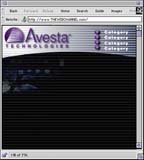
Changes include:
- White background
- Logo enlarged
- Drop shadow behind logo
- Clock removed
- Imagery encased by screen shape
- Horizontal lines fade to a gray-blue shade, not to a gray as seen in 2b.2
- Eclipse inserted
- "Power" in white
- New tag line treatment